Introduction
Role & Overview
Primary Notetaker
UX Research
UX Design
Key Deliverables / Tasks
Consolidated Notes
Personas
User Workflow
Wireframes
Usability Testing
Project Length
September 2014 - March 2015 (not continuous)
Background
AiM conducts vehicle inspections on a national level, but what makes them unique is their flagship product MarketConnect (MC), which facilitates the buying and selling of vehicles in the wholesale auction industry. AiM understood that their competitive advantage was MC, but they also understood that their product wasn’t perfect. As one of the executives put it, “Our product is great, it’s just clumsy.” In 2014, Areteworks was brought in to improve the usability and user interface of MC, which would further solidify AiM as a market leader in the auto inspection industry.
The Problem
MarketConnect had usability issues and an outdated user interface that created a less than optimal user experience for new and current users
MarketConnect was not created with the user in mind and failed to meet the needs of their main users (dealerships, fleets, institutions)
Poor retention rate at the dealership level (80% of dealership users left after 1 year)
The power of MC was that it made the process of getting your vehicle inspected and selling it easy, convenient, and seamless. Unfortunately, the engineers who built MC had forgotten to factor in the user during development, which created a product that worked functionally, but failed to meet the needs of its users. To AiM’s credit, they were not a tech company, so the fact that they were able to develop a product on their own to meet their business needs was remarkable. However, with little user-centered design thinking going into the process of creating MC, it turned into a product that was far from being user-friendly.
The Solution
Our end goal was to improve the user experience and user interface of MC, and to do this properly, we would need to become advocates for our users. This meant conducting extensive user research to answer some of the questions we had, such as: what problems are users running into; how do we help them accomplish their goals; what features and functionality can we add to improve the user experience; and what design decisions can we make to improve usability. However, before diving into user research, we had to start by building a solid foundation, which starts with a kick-off meeting.
The Process
At a Glance
5 Weeks
32 Users Interviewed
1 Missed Flight
6 States
15 Companies
30+ Coffee Breaks
15 Field Interviews + 2 Online Interviews
7 Dealerships, 8 Fleets, 1 Institution
15+ Continental Breakfasts’ Consumed
Kick-Off Meeting
The kick-off meeting was attended by myself (primary notetaker), our chief experience designer (President of Areteworks, a.k.a. my boss), AiM’s stakeholders (CEO, COO, and VP), and our two points of contact at AiM (both Directors). This meeting was important for establishing a productive partnership that fostered trust and clear communication between our team at Areteworks and our client, AiM.
Although our common goal was to build a positive user experience for MC users, we knew our client had their own goals, ideas, and business requirements, which we were eager to learn about during the kick-off meeting. In addition, the kick-off meeting would be our opportunity to discuss what our client thought was important, allow us to set clear expectations, and learn about AiM’s users, product, business, and current challenges from their (our client’s) perspective.
“It’s important to consider the client’s business requirements and to listen to the features and functions they think should be added, but remember, clients are not users. The best design decisions will come from learning about your users, so take what your client says their users want with a grain of salt until you talk with your users.”
After the kick-off meeting, our team had a good idea of what AiM wanted, how their product currently worked, and how we should proceed. I consolidated my meeting notes into a 16-page document summarizing our high-level discussion points. Here’s a glimpse of what we discussed.
AiM - Kick-Off Meeting Notes - Table of Contents
A key takeaway for us was learning that AiM’s main customers were dealerships, car rental companies (fleets), and institutions (like Manheim). These were the user groups we wanted to learn more about, and the fact that 80% of dealership users stopped using MC after 1 year was concerning to us. We wanted to know why, and the only way for us to answer this would be to conduct our own ethnographic research.
Research
A Modest Proposal for User Research
We explained to AiM that the best way to improve MC would start with a deep understanding of their users, which we did not currently have. Fortunately, AiM understood the value of redesigning MarketConnect’s user experience through user-centered design and fully supported our request to start the project with user research.
Areteworks proposed 5 weeks of field studies conducting contextual interviews with heavy MC users from the 3 main user groups (dealerships, fleets, and institutions). It was important for us to learn how MC was being utilized by our users, and this could only be accomplished by observing users in their natural work environment.
“Listen to what your users say they do, but pay attention to what they actually do. Often times, what users say they do, isn’t what they actually do.”
We trusted that through ethnography, we would better understand the workflow and pain points of our users, and uncover key insights, which we would then leverage to make informed design decisions and propose solutions that supported how our users worked, addressed their needs, and helped them see MC as an invaluable tool to their business.
For our part, Areteworks would handle all interview sessions and provide AiM with a list of screener questions. For their part, AiM would find us users who passed our screener and assign us two dedicated Directors to accompany us on every field interview. As primary notetaker, my specific responsibility was to video record all interviews and take notes.
Field Interviews
I attended 17 contextual interviews (15 in the field and 2 online), traveled to 5 states in 5 weeks, captured over 10 hours of interview footage, and consolidated our data into 144 pages of notes totaling nearly 30,000 words. I know it sounds like a lot of work, but collecting the data was actually the fun part. Travelling to Utah, Florida, Georgia, Michigan, and New York was amazing. Eating at a new restaurant every day was epic. But the cherry on top was meeting our users in-person, listening to their ideas, hearing their frustrations, and seeing how they worked.
Our team wanted to know 3 things:
Understand how users were using MC
Identify the issues they were having
Learn about their specific business needs
Therefore, my primary goal for each user interview was to capture their workflow, pain points, and the nuances of their business. We felt that identifying these 3 things would allow us to craft an experience tailored to their needs.
For the most part, each interview followed the same process. Our lead researcher would start by asking a few questions to build a user profile. These questions were fairly straightforward, so they also served the purpose of putting our users at ease. For example, we would ask them what their role in the company was, their responsibilities, and about their history with using MC. From there, we’d start asking questions that would help us understand how MC fit within their business. For example, we’d ask questions like, who their competitors were, the tools and software they used to sell cars, the things they considered important when buying or selling cars, etc. Then, once we felt our users were comfortable with us, we would ask them two questions:
Show us how you order an inspection
Then, show us what you do after the inspection is completed
As they walked us through the process, we kindly reminded them to speak aloud and to think of us as apprentices learning from the masters. Adopting an apprentice-master relationship meant that we would avoid making suggestions or directing their actions. It also emphasized the fact that we were not concerned with testing their technical ability or knowledge and showed that what we cared about was observing how they actually used MC and seeing their problems come to light first-hand.
Throughout the entire interview process, I took notes ferociously and listened to what our users said, but watched what they did. Then at the end of the day, I would review my notes, re-watch specific sections, and consolidate my notes into something that was presentable for the team.
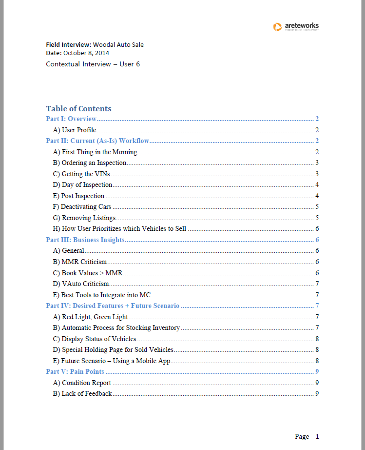
To give my notes some consistency and structure, I organized most of my notes with 6 identical sections: overview, current (as-is) workflow, use cases, business insights, desired features, and pain points.
AiM Contextual Interview - User 6 - Table of Contents
The Ideation Phase - Data into Insights
Making Sense of the Data
After all was said and done, I had pages upon pages of user data. 144 pages to be exact, and if you’re thinking that’s a lot of data to read through, tell me about it. Collecting the data was easy enough, but making sense of the data? That, is what I found difficult, and I had a hard time going through all of my notes and extracting the nuggets of wisdom our lead designer loved alluding too.
With so much user data, I had a hard time seeing the big picture and found myself getting lost in the details. It was hard for me to comb through the data and extract the key insights that our team could use to suggest improvements and make informed design decisions.
Fortunately, our lead designer (my boss) was there to point me in the right direction. After our field studies, he asked me to summarize my research notes by coming up with 8 key insights, and suggested I focus on solving the needs of our most common users. To conceptualize a typical user, I created 3 personas.
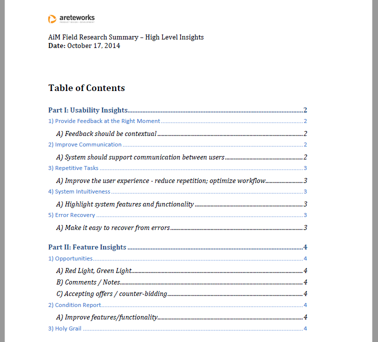
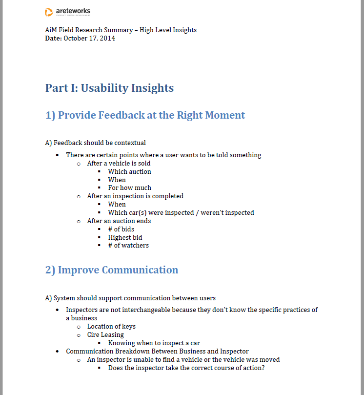
I then came up with 5 usability insights and 3 feature insights, which would help our team during the ideation phase by serving as a reference point for potential design solutions.
AiM Field Research Summary - High Level Insights - Table of Contents
AiM Field Research Summary - High Level Insights - Page 2
Before heading into the design phase and working on our wireframes, our team wanted to meet and process the research together.
Internal Brainstorm
With our research done, it was time for the fun part, coming up with design solutions. This part of the process involved our chief UX designer, lead UI designer, and myself coming together for a brainstorming session. During our brainstorm, we looked at the UI of competitors and similar products, discussed our research findings, and tried to come up with design solutions collaboratively. We also spent a great deal of time discussing the usability and user problems we thought were most important to solve, and did not move forward until we came to a shared understanding.
You can find a glimpse of what our session looked like below. What isn’t pictured is the mountain of sticky notes, markers, and empty coffee cups scattered throughout the room.
Areteworks - Internal Brainstorm
Areteworks - Internal Brainstorm - Mental Model
The end result of our session was coming up with two design concepts that would be differentiated through their navigation style. The first concept would have a vertical-navigation menu, while the second would have a horizontal-navigation menu. Before leaving, we each decided which concept we wanted to wireframe. I chose concept 2 (horizontal-nav), our lead UI designer chose concept 1, and our chief designer said he would work on a super-secret 3rd concept.
Design
Wireframes
After designing our wireframes, we met once again to share our work. The super-secret special concept our chief designer worked on turned out to be a mobile version of MC, and to his credit, it was a good idea that turned out to be something our users and stakeholders liked very much. I know that now days, it’s synonymous to have a desktop and mobile app, but 8 years ago, many desktop applications were standalone products without mobile counterparts.
Although the wireframes I designed were not used in the final prototype design, I have included a sample below for your viewing pleasure. For what it’s worth, I’m proud of the design I came up with, but it failed to capture the sleek, intuitive, minimalist design aesthetic that shined through in the wireframes designed by our lead UI designer. Truthfully, her wireframes looked much better.
AiM - MC - Wireframe - Horizontal Navigation
User Workflow
Before moving further into the design process, our chief designer wanted to conceptualize the MC user workflow, from start to finish. Another researcher and I were asked to do this, and although it was her workflow that was ultimately chosen as the final client deliverable, I have included my workflow below.
Design Through Collaboration
It was important for us to involve our client in our design process, so we held a two-day brainstorming workshop between AiM’s team of executives, project managers, IT professionals, field operatives, and salespeople and our team of designers and developers.
We began the workshop by presenting our workflow and main research findings, including the pain points we thought were most important to solve and the features/functions we thought would have the most impact if implemented. Our objective was not to show and tell, but to gather feedback, finalize our user workflow, and make design decisions that made sense.
After presenting our work, we split into 5 groups, led by 1 designer and made up with an even mix of AiM professionals. That is, we made sure no group had only salespeople or only IT professionals. I personally did not have the experience to lead one of these groups, so I split my time between each group and was tasked with documenting our process with pictures and notes.
On day 1, each group was asked to complete two tasks:
Define the ideal MC workflow
Create a top 10 MC feature list
On day 2, all 5 groups came together and presented their work. We then worked together to come up with a consolidated workflow and top 10 list.
The workshop confirmed we had the correct user workflow, and gave us the confidence to move forward with finalizing our wireframes. I was not involved in the process of finalizing our wireframes, but I was involved in our usability tests.
Test
Usability Testing
Our lead UI designer created high-fidelity wireframes for two MC concepts and our developers created a web-based prototype to test each concept. The first concept presented MC with a vertical-navigation menu, while the second had a horizontal-navigation menu. We conducted 8 usability sessions, and over the course of 5 days, traveled to Florida, Georgia, and New York to test our design with current and ex-users. Each usability session was moderated by our chief designer and presented each user with 11 desktop use cases and 3 mobile use cases. Each use case represented a task, screen, or feature most users would utilize in MC.
As primary notetaker, I was responsible for recording each session and taking notes. I paid close attention to what our users did and noted where they ran into problems. I was also concerned with gauging our design’s usability, intuitiveness, and workflow compatibility. If our design failed to support the user’s existing workflow, then we would see that as a failure on our part, and need to reconsider our design choices. When redesigning MC, our goal was not to radically alter the way our user’s worked, but to build a product that would support how they worked.
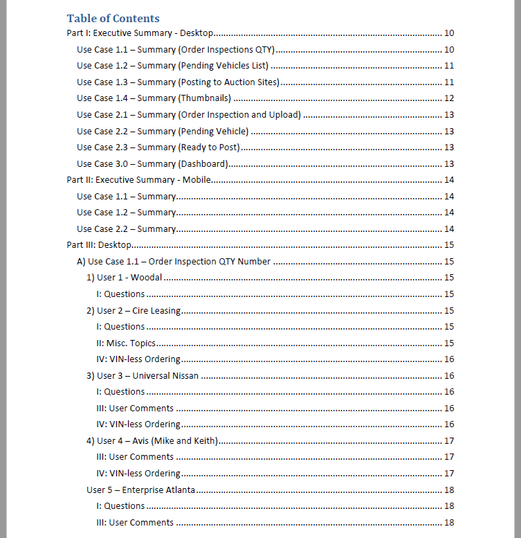
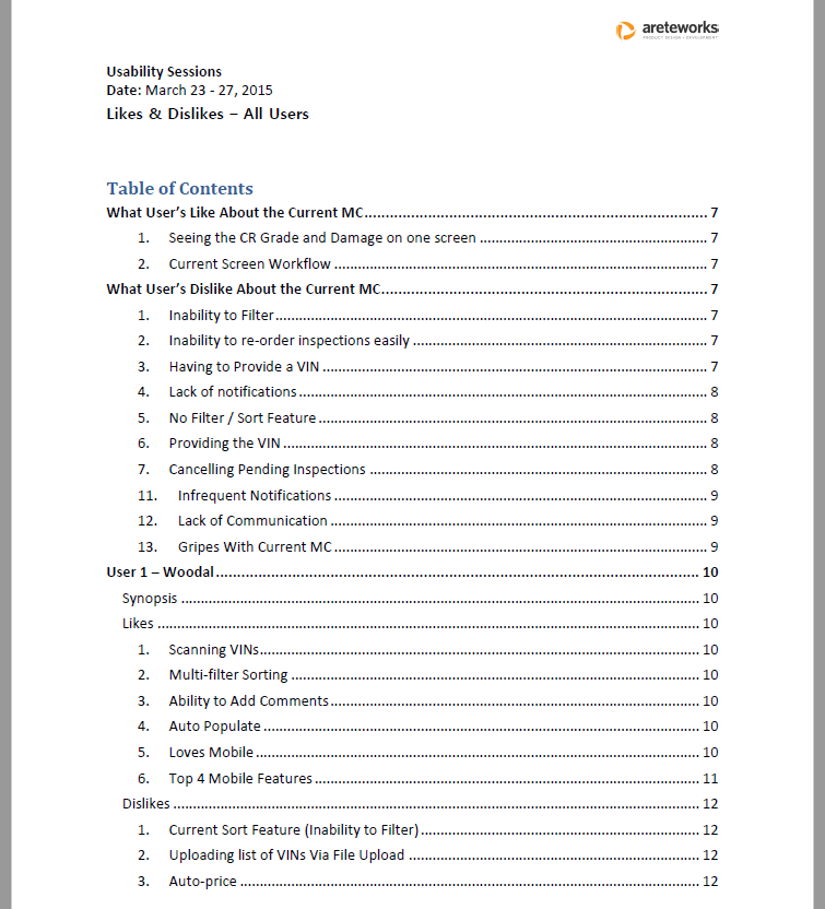
Once our usability sessions concluded, I had 8 discussion guides filled with notes, but lacking any real structure or theme. In other words, these notes were not presentable. I spent several hours reviewing our recorded sessions and then used the raw notes in my discussion guides to create two papers that summarized our findings for the team.
In the first paper, I went through each use case and summarized each user’s comments, questions, and usability issues. I thought this would be an effective way of understanding what worked and didn’t work in our design.
In the second paper, I discussed what each user liked and disliked about our MC redesign. It should be noted that when we refer to likes and dislikes, I’m not talking about whether our user liked the color of a screen or the shape of a button. We were not concerned with testing the visual appeal of our design, but rather determining the features and functions that resonated (or didn’t) with our users.
With the initial research and design phases coming to an end, my role in the project officially came to an end after handing off my usability notes. At this point, our chief designer started to work more closely with our lead UI designer and our developers. I may have been involved in a few of the meetings that took place after, and I probably would have continued to be involved, but I left Areteworks to start a new journey at Lytx before I could see the final outcome of our work.
Closing Thoughts
What I Learned
This was my first real UX project out in the wild, and the most important thing I learned is that I really liked doing UX work. I enjoyed meeting new people, visiting new places, learning new things, and doing something that helped people.
I rewrote this case study in 2022, 8 years after completing this project, and to be honest, I’d forgotten just how much work I’d done. I’m proud of what I accomplished as a 22 year old designer. That said, I can’t overlook the areas I struggled with. I recognize that the wireframes and workflows I designed did not make it into final production, and yes, my lack of experience definitely played a role, but I think it’s also fair to say that I had trouble seeing the big picture and digesting the amount of data I collected.
Using our data to formulate design insights was not an intuitive process for me, and I relied on my team to help me. Even so, I learned three important things during this project:
Listen to what your users say, but watch what they do.
Don’t expect to find a one-size fits all solution. Your design will never make everyone happy, and that’s ok.
Design is iterative. It’s ok to be wrong, it’s ok to make mistakes, so long as we learn from them and correct them.
